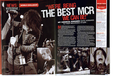
The punk/emotional rock influence on the magazine is instantly recognisable within the setup and pictures of the double page spread, where the article is expressed as a “World Exclusive”, making it seem unique and special, where it is only available to the readers of ‘Kerrang’-it is also emphasised that the band has “invited” the magazine specially to their recording studio, so that readers can get an insight into the life of a famous band and the ‘celebrity lifestyle’-increasing fandom for the band. The majority of the two pages are used up by images, where there is only a small amount of text on the second page. Each of these pictures has been manipulated, to create a black and white effect, which matches the dark (almost gothic) emotional rock style of the band and its music. This is complemented by the bright red colour of certain text on the double page, which also relates to the bands style, with connotations of anger, blood and excitement. The font used for the title is very clear, using a ‘worn out’ effect, again relating to the punk style of the band. This title has then been set at an angle, and “best MCR” has been highlighted by using a larger font than the rest of the title, in white rather than red. This gives a subtle hint of informality to the double page spread, giving it more entertaining feel as the mode of address.
Language is also used as an advantage to the magazine, differentiated from other music magazines by its unique mode of address to its readers.The title of the article is a quote from the band itself, which uses specialised language, such as “MCR”, that only certain groups in society will understand, creating a sense of community within the magazine. Other language used in this short article is often professional within the music industry, relating to the affluence of the young audience that may take an interest in the magazine.
This double page article opened my prospective to ways in something like this can be presented and it could be used to reach an audience. One would think that and article like this should be full of writing and less pictures. This to me establish the point that an article with more pictures and less words can still reach the intended audience in the same way as and article with more writing and less pictures. I think its a very interesting way of putting forward an article and it has definitely given me ideas on how i could represent my audience.
The party fun look on the magazine is one of the first things that catches your eyes when looking at this article. There are a range of bright colors used which stands out on the white background of the page. The colors create a party theme because they are bright and lively, which get the readers interested in wanting to read the magazine. The whole party idea is supported by the images on the article. In every image we see some portrayal of clubbing/partying taking place. The images is also of young people only thus establishing without a doubt who the audience is, young people who love having fun and love partying.
There is much more writing in this article compared to the rock article, there is also a lot less bright colors used in the rock article. Which give a clear cut distinction between the two magazine article. The language used is very informal and supports the party theme "Party Maison". In this article there is nothing misleading about it because all the elements come together explicitly to portray one main theme which i thought was brilliant.
This raises my awareness of the importance in combining the elements so that it can be unified when attracting and representing your audience. This has changed my thinking on how i should really go about planning the representation for my magazine double page article.

