Wednesday 1 December 2010

Analysis and comparison of three double page articles from music magazines

The punk/emotional rock influence on the magazine is instantly recognisable within the setup and pictures of the double page spread, where the article is expressed as a “World Exclusive”, making it seem unique and special, where it is only available to the readers of ‘Kerrang’-it is also emphasised that the band has “invited” the magazine specially to their recording studio, so that readers can get an insight into the life of a famous band and the ‘celebrity lifestyle’-increasing fandom for the band. The majority of the two pages are used up by images, where there is only a small amount of text on the second page. Each of these pictures has been manipulated, to create a black and white effect, which matches the dark (almost gothic) emotional rock style of the band and its music. This is complemented by the bright red colour of certain text on the double page, which also relates to the bands style, with connotations of anger, blood and excitement. The font used for the title is very clear, using a ‘worn out’ effect, again relating to the punk style of the band. This title has then been set at an angle, and “best MCR” has been highlighted by using a larger font than the rest of the title, in white rather than red. This gives a subtle hint of informality to the double page spread, giving it more entertaining feel as the mode of address.
      Language is also used as an advantage to the magazine, differentiated from other music magazines by its unique mode of address to its readers.The title of the article is a quote from the band itself, which uses specialised language, such as “MCR”, that only certain groups in society will understand, creating a sense of community within the magazine. Other language used in this short article is often professional within the music industry, relating to the affluence of the young audience that may take an interest in the magazine.
  This double page article opened my prospective to ways in something like this can be presented and it could be used to reach an audience. One would think that and article like this should be full of writing and less pictures. This to me establish the point that an article with more pictures and less words can still reach the intended audience in the same way as and article with more writing and less pictures. I think its a very interesting way of putting forward an article and it has definitely given me ideas on how i could represent my audience. 


The party fun look on the magazine is one of the first things that catches your eyes when looking at this article. There are a range of bright colors used which stands out on the white background of the page. The colors create a party theme because they are bright and lively, which get the readers interested in wanting to read the magazine. The whole party idea is supported by the images on the article. In every image we see some portrayal of clubbing/partying taking place. The images is also of young people only thus establishing without a doubt who the audience is, young people who love having fun and love partying.
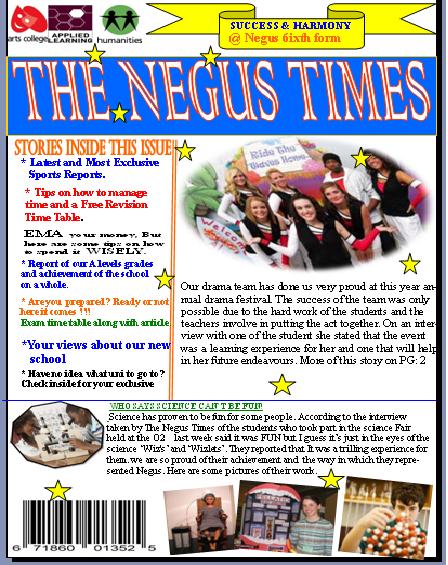
    There is much more writing in this article compared to the rock article, there is also a lot less bright colors used in the rock article. Which give a clear cut distinction between the two magazine article. The language used is very informal and supports the party theme "Party Maison". In this article there is nothing misleading about it because all the elements come together explicitly to portray one main theme which i thought was brilliant.
   This raises my awareness of the importance in combining the elements so that it can be unified when attracting and representing your audience. This has changed my thinking on how i should really go about planning the representation for my magazine double page article.

Sunday 21 November 2010

Analysis of music magazines content pages

The content page for Q magazine is very
 simple, there is no fancy editing tricks used.
The layout of the is well put together, it is neatly
separated in boxes. It has a simple and clear title
with the issue number beside it. 
  Down the left hand side the features are laid out
very clearly, one beneath the other.The Sub-heading
for each feature is in bold letters and a clear separation
can be seen between each one. There is also a splash of
red with some of the fonts rather than black to make it 
stand out from the rest and draws the readers attention.
    The image down the right had side have been used to
give the readers a glimpse of what the article may be about
without revealing everything. Overall this content page is very
clear and supplies the reader with easy access to the content
of the magazine. It is also very organised, classy and well put
together.


This is a content page from Vibes magazine. I think it
took a very unconventional way in portraying an image
on its content page. The layout on this is very creative
and brings a whole new feel to what a content page 
should look like.
   The writing on the page is very organised as the 
text on the content page of Q magazine. The color 
of the fonts compliments the whole color scheme. 
The text is also aligned with the edge of her legs
showing how it works with the image.
  There is only one image used  on the page, she is
in an awkward position but it just adds to the 
presentation display. Seeing that there isn't many
images used it adds to the simplicity and calm feel
of the magazine. On overall this content page just
shows that a content page doesn't have to be 
crowned with images and bright color to look
good and attractive. It shows that simple can get 
the job done.

This is a pop/rock music magazine content page. The content page is
is very different to that of the one from Q magazine. There are a variety
 of images used on the page which is surrounded by the text on the page. 
The colors in the images blend in with the whole color scheme.
The title seem to be the biggest piece of writing on the on the page
and it in pink and red which stands out on the black background and
draws the readers attention to it. The font colors are coordinated to 
match in with the whole color scheme which is an important tool in 
catching the readers eyes. 
 The layout arrangement of the magazine was well put together. In
some ways it was similar to the other two magazine in that the arran-
gment of the text were very precise and not all over the place. It was 
quite a shocker for this magazine because one would expect it to be
all over the place and crazy but it's not.The execution of the whole 
presentation was very much well done. 


Thursday 18 November 2010

negus magazine front cover

MARKET RESEARCH QUESTIONnAIRE

READER PROFILE
The readers population of my magazine would be a vibrant group of 17 to 20 year olds, 65% of the readers would be males and the other 35% are females. Most of the participants are unemployed, the only source of income they have are their parents or EMA and are only willing to purchase a music magazine if it's under 5 pounds. They are most likely to read a music magazine monthly or whenever. The type of music they're interested in are Hip-pop and R&B and is most likely to listen to those music via their ipods or the internet. Some of the things they would like to see on the front cover of  the magazine relates to the different genders groups so females readers would like to see Gossips and insiders stories on what stars are up too while the male readers are more interested in finding out things like what the next Gigs will be and upcoming events. The reasons given by some of the participants on why they would buy a music magazine are if they're ' freebies'  such as tickets to gigs or to a live show and the latest news on things they're most interested in. Another thing that the participants who took part in my research wanted to see is more of their local British  music artist such as JLS, Leona Lewis, Alexandra Burke and The Wanted being displayed in the music magazine.

THE IMPACT IT WILL HAVE ON THE MAGAZINE
I think the most important impact the questionnaire will have on the magazine is changing the way in which it will try to collectively present information to its audience. The audience are 17 to 20 year olds and the magazine will have meet the needs of its audience which maybe a difficult task to complete seeing different individuals belonging to that age group will have different interest. It will also impact the production cost of the magazine seeing that most of the buyers would be students and young people who are unemployed and rely on their parents and EMA as a source of income. If the magazine is priced too expensive then the interested readers will not be able to purchase it. The target audience are more male than female and as a producer of a magazine you would have to try and keep the majority of your audience while still trying to please and keep the minority while trying to attract new audiences every day, a balance would need to be found when portraying things to help meet the audience needs. The questionnaire gives a basic understanding of your audience but it also changes the way in which everything in done in the production and presentation of the magazine.

MUSIC MAGAZINES

For my R&B music magazine i used a very basic color scheme which 
i think recognizes its self with everyone. I placed my image on a white
 background which helps bring out/magnify the colors of the image and the text
 that is placed on the photo.I used a variety of fonts for the magazine, the font 
style for the title is different to the fonts on the rest of the page i thought by
 doing that one it would be very interesting and also it will draw attention to the
 different element on the page. The text are in a variety of colors and sizes as well,
 this also helps draw the attention readers and establishes which things on the cover
 is a 'most read' story if i may call it that.The image on the cover of the magazine is
 very similar to those that are on R&B magazines front covers. It is a picture of a very
 sexy woman,who looks very seductive and confident in her pose, it is also a picture 
of a famous singer in the music. This helps appeal to both men and women firstly
 because it is a picture of a very sexy women who has a very large ass that catches 
every ones attention and secondly it a picture of a famous singer. The name i chose
 to give my magazine was just from a poster i saw an thought it was quite interesting
 and would sort of fit in with the genre of my magazine. The language on the cover is
 very informal because of the audience it's aimed at, there was a lot of slangs used
 which would help connect the magazine with the audience.

For my Indie magazine the image takes up the whole page. By just looking at
the image the audience would be able to identify themselves with the genre of
 the music base on the way the characters are dressed in the image. The boys 
in skinny jeans with a sort of ruffle hair do while the girl is dressed in vintage 
look. The vintage classy look is supported by the piano in the picture which is 
out dated to some extend. The is quite formal, no slangs are use as in the R&B
magazine front cover because the readers of this magazine are classy and
professional to some extent. The color scheme i chose for this magazine is white,
red and a touch of yellow. I chose to use the red and white simply because it
blends in the colors the characters are wearing and i chose the yellow because
it will stand out and sort of give a different feel to the magazine. I also displayed
some other indie artist which i thought would help support the main image in 
appealing to its audience also to help diversify the out look of the magazine. The 
name i gave the magazine is dutch i think and is the name of an indie band.
If i had to do anything different i would try to use a variety of images which
would be of a more professional standard.


Everything i chose to do for this magazine is very stereotypical of a metal music 
magazines. The color of the background is black which gives it a very spooky
feeling which is usually associated with  a heavy metal magazines.The image i used on
the cover was a woman dressed in dark clothing looking kinda scary, i also chose to
put a shadow effect to the picture which helped bring out the whole metal concept. 
There are different font types used on the cover, the font style of the title is very different 
to that of the font types on the rest of the magazine. The styling of the fonts i think is a major 
contributer to the whole metal idea because they're quite Gothic. The text are in different sizes
and colors which work well with the background of the image. There are also several other
 metal bands displayed on the front cover which helps in the drawing of the audience.

Tuesday 16 November 2010

HOW DO MAGAZINE FRONT COVERS USE DENOTATION AND CONNOTATION TO ATTRACT THEIR INTENDED AUDIENCE


How those magazine you have studied construct and reflect its intended audience.


Harmony and Success, Fitness First, Strike a pose, Film Star, Acting confident and so good we did it again. All this Sub-headings draws the attention of its intended audience. It gets them wanting to know more and interested in the content of the magazine. By just seeing the heading it gets you thinking about what’s to come. Each sub-heading identifies its self with a separate audience. The fonts  for the sub-headings is different from that of the content fonts and quit simple there is no fancy effects added to it, the text size is larger and bolded in heavy black which makes it very recognisable. In terms of content one of the first things one would see is a large text so this proves that it is important in helping to draw an audience. The font style of the title is different from that of the content; it's the largest text on the page which gives it power over the other text on the pages. It is portrayed as the most important thing on the page. The background colour compliments the colour of the title; this was done in order to draw attention to the title. All the other writings on the pages are black and the title colour is white, this draws attention and places focus on the title. The title also helps associates the magazine with an audience. This is a school magazine and the title helps link the magazine it to the audience also the magazine is full of young people which could help establish and age range of the intended audience which would be students and maybe interested personnel such as parents and intended students who may be interested in the school and what it those.
   
 Colour is an important part of mise-en-scene in that it creates the mood and atmosphere trying to be portrayed by the magazine. Most of the colours used in the magazine were very mild and sectioned, they weren't mixed in together, and this could convey a message of simplicity and informality. Each image has its own identity and conveys its own messages. But I think the most important photos in the ones on the front cover because it's one of the first things you see. The photo on the right of the front cover is cropped into the background colour, the lighting of the photo seem very artificial, she is quit boxed in with the frame which restricts her movement. she is also one of the largest objects in the photo, the shot is shallow and places her in the spot light, isolating her from what’s going on in the rest of the scene which makes her seem more important than what’s going on in the background. The character is placed to the edge of one side of the frame showing some distance between her and the other side of the frame. Most of the pictures in the magazine are either wide width which would give the character space to move or boxed in which would restrict there movement, the boxed in photos contain one character which would make them the central focus while the wide width photos contain more than one characters which shares the focus between them.

A variety of photo is used in the magazine. Each photo is expected to denote and connote something different. I place my emphasis on what the photo on the front cover is denoting and connoting. Looking at the photo on the right near the bottom of the page, we see a group of children dress up in what looks like animal costumes, behind what looks like a cage. This could imply that they're taking part in play pretending to be animals that is confined to a cage. Theses things are what attracts and identifies a magazine with its audience. The mode of dress of the characters supports the ideas and themes of what the magazine is all about. Most of the characters are dressed in their uniform or something that associates them with being part of a school. The way a character dresses says a lot about who the magazine is trying to attract.
All the images and Sub-headings in the magazine comes together collectively to address the different identities of its audience. It also gives and idea as to who would be interested in the magazine. For example the Film Stars sub-heading suggest that some who is interested in film production would be interested in reading the magazine, this just indentifies one of its possible audience. In my view most magazines identifies it self most likely with one audience so a fashion magazine would identify is self with people interested in fashion and not people who would be interested music or health but this magazine identifies it self with many audiences which makes it very interesting to analyse. It gives us something more than the ordinary to think about.